music player app ui design
Warming up
First of all we need to do something that helps us to code all these motion.
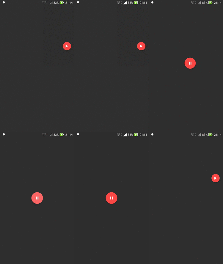
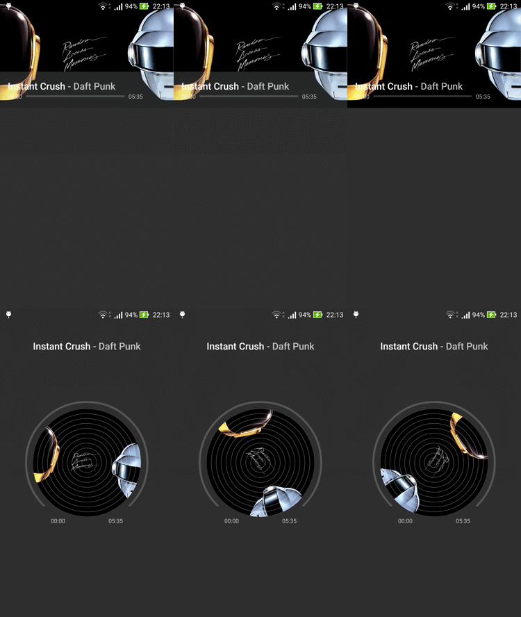
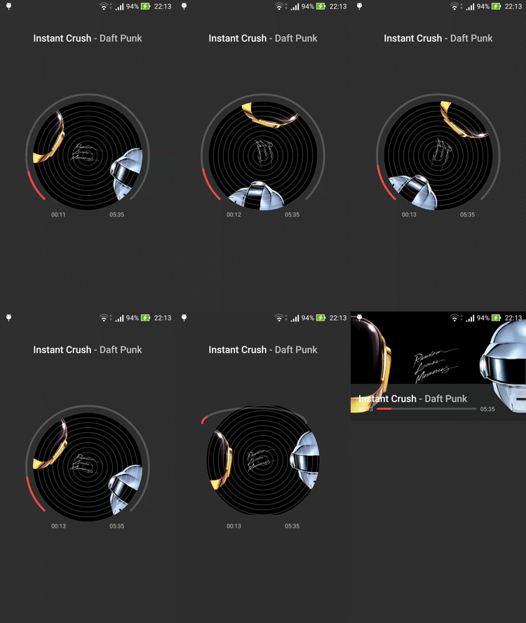
Split the motion proposal in frames
Convert the animated proposal file into individual frames. This will help us to view each step of the animations and transitions.
Separate by types
We have a lot of views transitioning and animating at same time, and think how to code this way will be very hard. We can separate those transitions and animations by type, for example: Views sliding to bottom, Views fading out, Views moving out to new Activity, etc.
The next tip is a good one to use in EVERY layout, with motion or not.
Simplify your view hierarchy
Create view hierarchy as simpler as possible, avoiding to use a lot of View Groups in the same layout. This will make easy the transition choreography, will help the maintenance, as well as improve significantly the app performance mainly during the animations.
How the magic happens
In layout files, some View Groups have the android:transitionGroup attribute set to true because they need to be treated as a single entity during the Activity Transitions as in the playlist info container (main layout file) or controls container (detail layout file).
In styles.xml we have the themes used in our Main Activity and Detail Activity.
- AppTheme.Main
Disable overlaying of shared element views. In this Music Player layouts we need to disable the overlay when shared element views is moving out from Main to Detail Activity. If it's enabled, some shared element views could overlay other views in a wrong manner.

It has the same transition approach in both exit and reenter transition of list content.
- Set a start delay to synchronize these transitions with the FAB morph animation.
- Fade just the pane view specified by targetId attribute.
- Slide to bottom the RecyclerView childs and playlist info container, excluding status bar, pane, and navigation bar specified by excludeId attribute.

It has almost the same transition approach in both exit and reenter transition of list content.
- PlayButtonTransition is a custom transition that wraps an AnimatedVectorDrawable and used to morph the play icon into pause icon or vice-versa, depending the mode value.
- AppTheme.Detail

It has the same transition approach in both enter and return transition of detail content.
- Fade just the ordering container specified by targetId attribute.
- Slide to bottom just the controls container specified by targetId attribute.

- Define an interpolator to the rate of change of transition, allowing a non-linear motion.
- ProgressViewTransition is a custom transition that uses a ProgressView to "morph" an horizontal progress view to an arc progress view.
- MusicCoverViewTransition is another custom transition that uses MusicCoverView to "morph" the rectangular cover view to circled cover view with track lines.
- Use default move transitions into the others shared element views.

In this transition was used almost the same approach of detail_shared_element_enter_transition. But it was added some delay for each part to match this transition with the proposal.
- The reverse "morph" mode, from arc progress view to horizontal progress view.
- The reverse "morph" mode, from circled cover view to rectangular cover view.
- Use default move transitions into the others shared element views.
Final Result

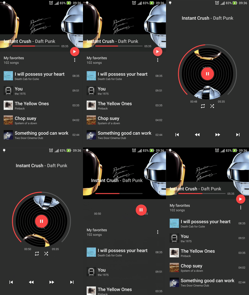
The final result should be like that. Of course, some minimal details can be missed in the final project but it would be a little thing.
Explore the entire project here:
music player app ui design
Source: https://medium.com/@andremion/music-player-3a85864d6df7
Posted by: oharewhouse.blogspot.com

0 Response to "music player app ui design"
Post a Comment