

How To Design Android App Quora
Why I think Quora's Android UI is messed up?
![]()
While reading answers on Quora everyday, I wondered why the UI is so cluttered. Fast forward a week, I stopped wondering and redesigned a concept of the actual app which I thought to provide better readability to the user.
I covered all the elements which I thought could be improved in Quora's Android App in the sense of it's User Interface.
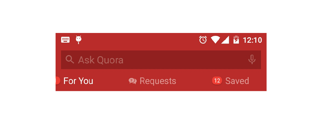
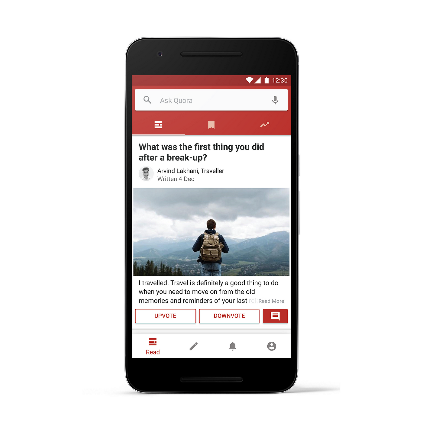
The tabs holding up much real estate ju s t below the 'Ask Quora' bar stating the three top-most functional aspects of the app i.e. Feed, Bookmarks and Trending are in the format of a Tab bar with text & icons. The part which got me feeling uneasy was, the icons were aligned alongside the text or the name of the section resulting in unnecessary usage of space. Improved it a bit in terms of visual overhaul. Here's how it looks now:
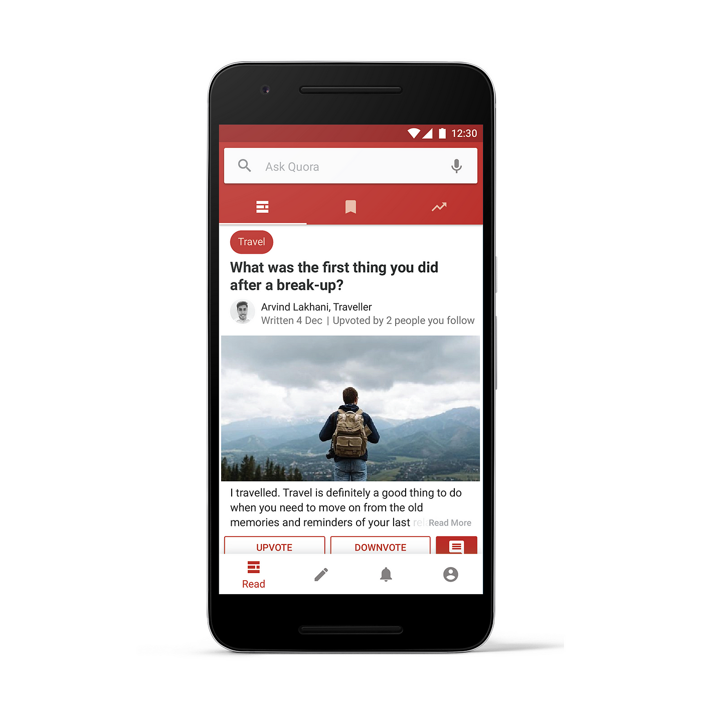
The left image being of the existing User Interface and the right one being the redesign.
Now coming to one of the most important function of the platform i.e. Ask bar aka Ask Quora bar, the existing icons are based on Ice Cream Sandwich UI making it look obsolete could be redesigned to the latest guidelines from Material Design icon library. Considering what Quora is made for i.e. asking questions and getting answers, the ask bar could be enhanced for a better visual appeal defining its primary purpose.
Also, the Read tab bar was just replaced a few days ago from a scrollable one to a fixed one, which happened to be a good move due to the fact that it contained just 3 fields (scrollable bars are used when the no. of existing tabs are more than 5 as they can't be accompanied within the screen altogether). But that too was done for only two sections i.e Read and You (the one showing user info) making the interface inconsistent in a lot of ways. The Answer Field was left with a scrollable one with just 3 tabs in use, resulting in a broken UI.
Moving down towards the content part, the questions don't start directly. Prior to the questions comes 3 tags : Answer written(or Question asked based on the type of content), Topic (under which the content is marked) and the time (when the answer was written).
Playing with the elements I placed the Topic above the question giving it more importance than any other tag. This let's the user to easily go to the topic under which the question was listed. The rest of the tags went along the answer i.e. right above the answer. Here is a representation of what I did.
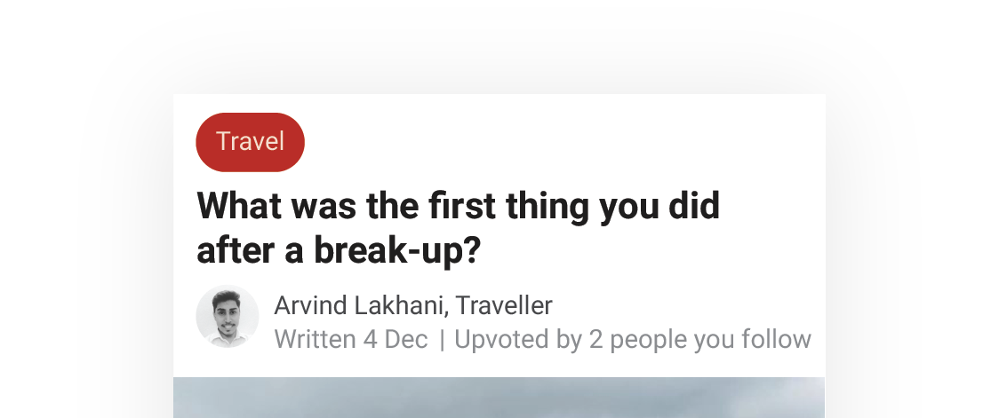
The topic can be described with the help of chips constituting to a better visual appeal and resulting into a cleaner User Interface and easy clickable approach to topics.
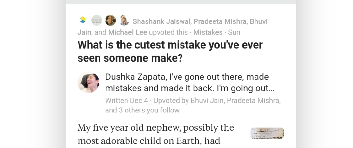
The current UI displays the people you follow if they upvoted an answer, above the question. They are displayed again after the latest time the answer was updated or written. This resulted in a repeated view of the names of people you follow upvoting the answer.
*complexity intensifies*
Although the ideology behind it would be of attracting users towards an answer upvoted by people whom they follow to increase the no. of views but displaying them in two different places for the exact same reason tends to make things more cluttered.
The Answer
The answer section was recently updated during my redesign process. The image attached in the answer was now displayed as a thumbnail alongside the answer in order to compress the amount of real estate a single answer was taking.
After the answer comes a section of action buttons to perform an upvote, a downvote or a comment and the rest of the actions are added to the list view which opens when a user clicks on the options indicated by the 3 dots present at the rightmost corner.
There is a bottom navigation bar to quickly toggle between 4 different screens: Read, Answer, Notifications and You(profile). The icons exists with the title of the section aligned to them vertically below them.
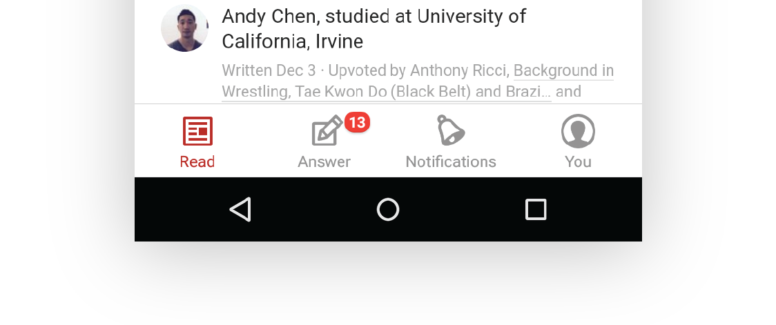
Though according to the material design guidelines "Bottom navigation should be limited to display inactive views as icons only if there are four or five actions." So, I redesigned the bottom bar according to the guidelines displaying only the icons which only display the title name below them when the current view is open.
Here's the final version of the redesigned Quora feed.
'Less is more'
My redesign was based on the concept of reducing the clutter which quora already has. Although, UX-wise it may not fulfill many of the needs. It can still be changed in a lot of ways.
Though Quora's UI is changing at a rapid pace, I think they still need to cover a lot of stuff on their way to a lighter UI and better readability.
On this node I'd like to sum up the article.
Thank you for reading through and having your patience all along. Here's a link to the original Ai file if you wish to see more details (nerd stuff ;).
Please comment on your views about the Redesign(there could be a lot of stuff I might have forgotten to add or have viewed through a wrong angle, kindly correct me if you feel the same).
Like and share with your fellow designers.
Much love. ❤
You can find me here :
Behance, Facebook, Dribbble or send me a hello at helloitsarvind@gmail.com
How To Design Android App Quora
Source: https://medium.com/@arvind13496/why-i-think-quoras-android-app-ui-is-messed-up-2343ace548e8
Posted by: oharewhouse.blogspot.com
0 Response to "How To Design Android App Quora"
Post a Comment